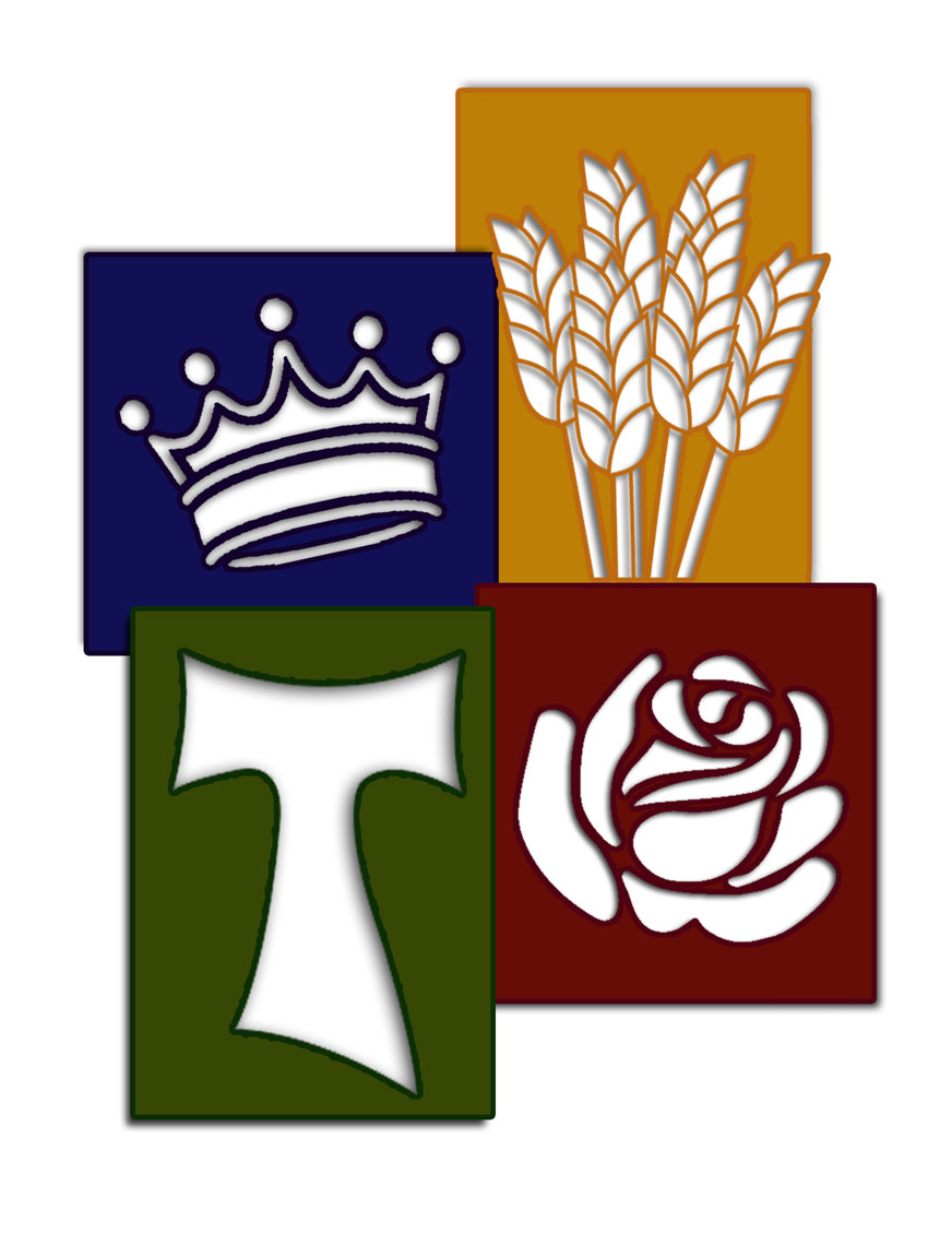
You might have noticed this new colorful logo that appeared several months back on all Parish correspondence, electronic media, bulletins and even t-shirts.
This new logo, designed by a member of the parish, speaks strongly of St. Elizabeth of Hungary and who we are as a parish. The four symbols used in the logo are meant to be easily identifiable and relate directly to St. Elizabeth of Hungry and our parish. The crown in the field of blue is meant to remind all that although a queen, she never let her position in life distance herself from those in need. The grains of wheat, representing bread, and the rose are the classic images used by the church to denote St. Elizabeth of Hungary. They refer to the hagiographic story of Elizabeth being caught hiding bread in her cloak as she went out at night to feed the poor. When stopped by her husband and forced to show what she was hiding, instead of bread, roses fell to the ground. The forth image used in the logo is the Franciscan Tau cross. This cross was chosen as the last symbol for two very specific reasons. After the death of her husband, Elizabeth became a secular Franciscan, a lay member of the Franciscan Order. After her death and canonization, not only was she named the patron saint of Catholic charities but also the patron saint of all Secular Franciscans. But this cross was also specifically chosen to represent the parish, under the care of the Franciscan order for the past seventeen years, through the intercession of Francis, Clare and Elizabeth, we strive to live our mission of making God known in the world.
I hope you like this new logo as much as I do, and may we ask through the intercession of St. Elizabeth to continue to deepen our love for Christ, and bring Him to all we meet.
May God give you peace!
